
Anime Avatar from a Photo: Which Features Still Look Like You?
An anime portrait changes how a person is drawn. Before a photograph becomes a character, decide what should remain recognizable: the eyes, hair outline, glasses or a familiar color arrangement.
Styles simplify different cues: one may reduce the nose and mouth to a few marks, another keep a fringe but replace the original palette. Name the details you want to recognize, then separate them from details that belong to the reference character.
The pictures below are AI-created style references, not a set of one person's photo transformed into four styles. They let us compare visible drawing choices; they do not demonstrate a current generation result or prove that any feature will be retained from your photo.
Start with the details that are yours
Describe the source portrait concretely: a narrow jaw, a left-side part, dark round glasses. Pick two or three details that matter to you. These are not universal recognition signals; they are the features you can check in the result.
Sort them into shape, detail and color. Shape includes face contour, hairline and the silhouette of curls, braids or fringe. Detail includes eyes, brows, nose, mouth, freckles and glasses. Color includes hair, skin, eyes and an accent you want to keep. A simplified drawing may retain shape but lose fine detail; a color-heavy reference may put palette first.
This resolves a common conflict: the reference has red hair and a flower crown, while your photo has black hair and glasses. Borrowing the character's hair and crown is different from preserving your own. Decide which cues belong to you and which to the artwork.
Manga linework and webtoon color ask for different compromises
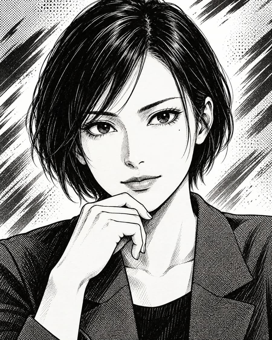
In the Japanese ink manga example, black hair is built from many narrow strokes, while the face and background use white space, crosshatching and screen-tone texture. Its visual vocabulary is mostly line and contrast. That can carry a recognizable hair outline without depending on the source hair's exact color, but small strokes and shading may merge when the portrait is reduced.
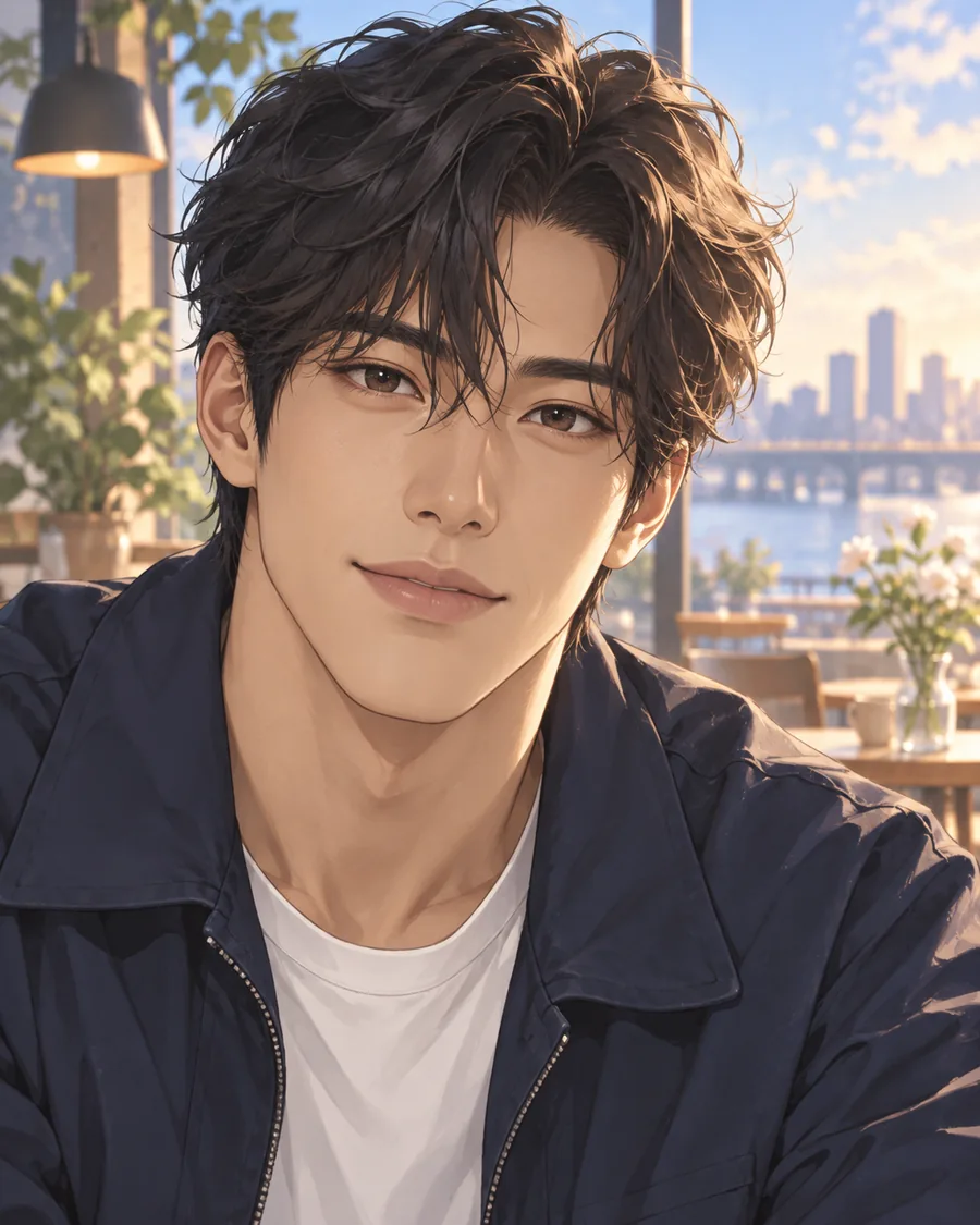
The Korean color webtoon example makes a different allocation. The portrait has warm highlights on the face and hair, a dark jacket, and a softly rendered city-and-window setting. Color transitions and light help describe the image; the background contributes atmosphere as well as context. If you want to keep a particular hair color or skin-tone relationship, this kind of reference gives color more room. The trade-off is that the scene and its lighting also become part of the look.
Neither is simply “more anime.” One favors graphic marks and dark-light separation; the other layers color and setting around the face. Check glasses as shapes: thin rims may disappear into hatching or highlights. A thick frame stays more visible but changes the portrait's graphic weight.
A reference brings its own character cues
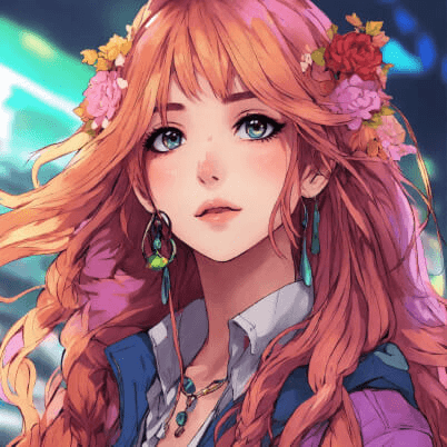
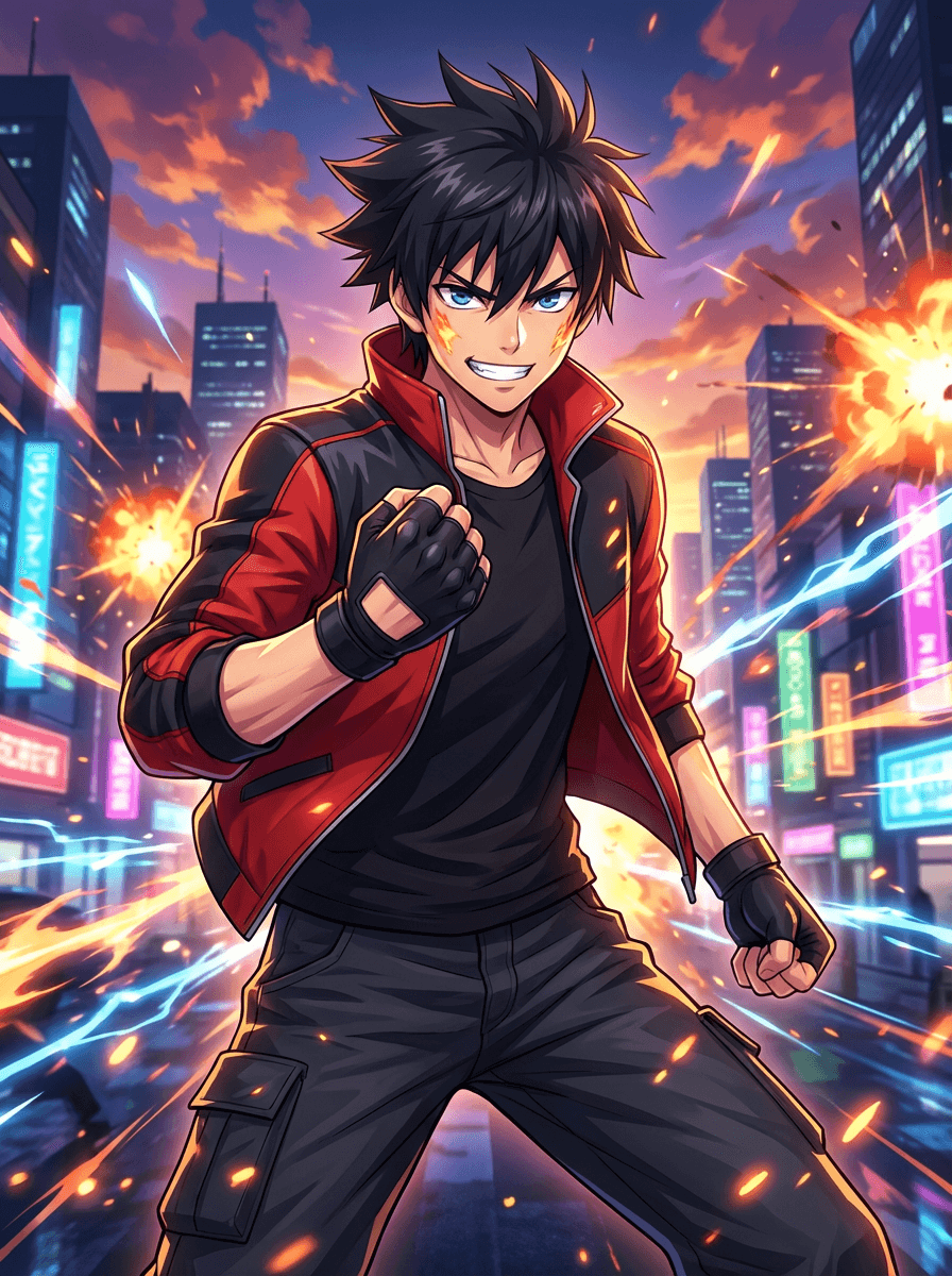
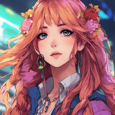
The floral anime portrait combines long pink hair, a flower crown and earrings against saturated blue-green. The crown is this character's design, not a neutral anime cue. The action manga image pairs spiky dark hair and a red jacket with gloves, flames and a city at dusk; its impact comes from role and setting as well as the face.
Ask what you like in a reference: eye drawing, hair rendering, outline, or the full costume and setting? Borrowing its fringe technique differs from carrying over pink hair, a flower crown or a hero pose. If every distinctive cue comes from the character, the result may read as a new character. That can be intentional; it is a different goal.
Make two columns: “from me” and “from the reference.” Put glasses and hair part in the first, flowers, costume, lighting and background in the second. Choose what to keep, adapt or leave behind. A portrait can only carry a few cues before its focal point gets crowded.
Decide how far the face should be simplified
Anime eyes may be larger and brighter than in a photo, but that changes expression as well as style. The ink reference uses dark outlines and lash marks on a mostly white face; the webtoon uses softer shading and iris color. Both simplify the eye in different ways.
If eyes, brows or expression matter to you, look for a drawing that shows them without highlights changing the expression. If exaggerated eyes are why you like the reference, treat them as a design choice rather than a likeness cue. A tiny nose or expressive mouth can also depart from the source while making a strong illustration.
Glasses are both a personal cue and a graphic object. Dense eye lines may compete with thin frames; reflections can obscure lenses; heavy frames can dominate. If you want to keep them, compare frame shape, position and bridge—not just whether glasses appear. Removing them is a deliberate change, not one the rest of the face automatically repairs.
Keep a hair outline, a palette or both?
Hair can be easier to describe as a silhouette than a color: “shoulder-length waves with a side part” gives a contour and direction. A style may redraw strands while retaining the general outline. The ink portrait uses dark strokes to define a bob and fringe; the floral portrait lets long sections spread outward and overlap the crown. One frames the face; the other becomes a larger decorative shape.
Color is separate. Keeping dark hair maintains a familiar element; changing it to the reference's pink or red makes the new palette more central. Neither guarantees recognition. Decide whether to keep a shade, a light-dark contrast, or just one accent. The webtoon's warm face and dark jacket differ from the floral image's pink hair against green-blue.
Review the result as a portrait, not a character sheet
Compare a candidate beside the original at the same size. Check your two or three chosen cues—face outline, hair part, glasses or palette—then ask if a reference detail has displaced them. A flower crown, dramatic lighting or enlarged eyes may become the focal point. That is a trade-off to accept or revise, not automatically a flaw.
If the full image works but a small avatar does not, note which cue disappears. Fine hatching, thin glasses and subtle color may merge; a hair silhouette or bold palette may remain. This is visual review, not a recognition test. See how to choose a profile picture for small-picture framing and the profile-picture style guide for broader illustrated directions.
Use these references to name what you like—ink density, warm color, hair contour or decorative framing. To explore a direction with a photo you have permission to use, the anime avatar creator offers anime, manga and webtoon references.
Start with the details you want to recognize, not with the name of a genre. Then choose a reference whose drawing supports those details—and decide which parts of its character design you are willing to borrow.