
Oil Painting vs. Watercolor Portrait: Which Fits Your Photo?
Oil painting and watercolor are not a ranking from formal to casual. They are two broad ways of organizing a painted image, and either can be quiet, loose, detailed or dramatic. When choosing a portrait reference, look past the medium name. Ask what happens to the edges of the face, how much color covers the subject, where texture appears, and whether the background competes with the person.
The two examples below make those questions easier to see. They show different figures from existing style-reference galleries. They are not the same person in two media, not customer results, and not a comparison of RemixAvatar generations. Use them to inspect the pictures themselves, then make the same checks on the photo you might use.
Oil-style reference: clear shapes can still compete with the face
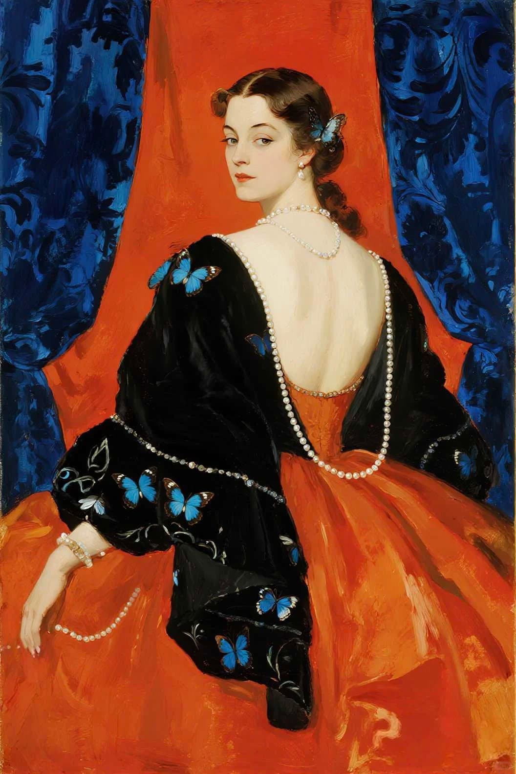
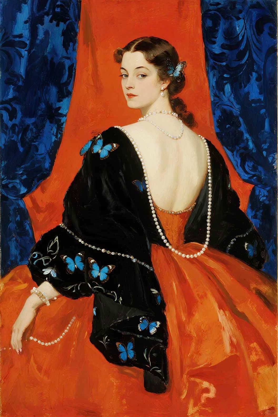
In the oil-style example, the red-orange field and blue butterflies make a high-contrast frame around a woman turned partly away. The dark dress creates another large block, while the painted face is comparatively small. You can still read the gaze, nose and cheek, but the first impression may be the color arrangement and the repeated butterflies. That is useful if you want a portrait with a strong decorative identity. It is a trade-off if your main reason for using a face photo is to keep the face as the first thing people notice.
Look closely at the hairline, shoulder and butterfly edges. Some are sharply separated from the neighboring color; other areas merge into broad painted shapes. Those changes make the image feel intentionally composed rather than like a photograph with a filter laid on top. But clear edges do not guarantee that every personal feature will stay clear in a new image. A reference can guide an overall look without promising exact brushwork or facial detail.
The same example also shows why “oil” does not mean “thick paint everywhere.” Its surface mixes broad, smooth color areas with visible brush marks and more defined small details. In traditional painting, artists can apply oil paint in thin translucent layers or build it into textured impasto; the label alone does not tell you which effect dominates. The National Gallery describes oil as a medium whose handling and visual effects depend on the medium, pigment and technique, and explains impasto as visibly built-up paint. National Gallery: Media · National Gallery: Impasto
Watercolor-style reference: open edges create atmosphere, and can soften a face
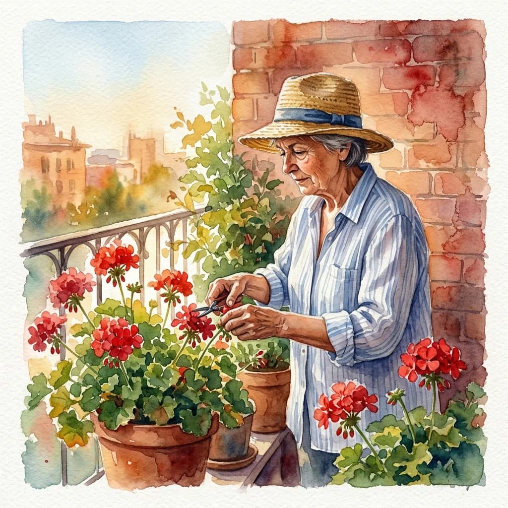
Here, the portrait shares its space with red flowers, a brick wall and a pale sky. The painted edges do not all stop at the same crisp boundary: color softens around the distant buildings and foliage, while the hat, face and blue shirt retain more structure. That gives the scene air and makes the garden part of the subject. The gardener’s lowered gaze and hat brim also leave the eyes less exposed than in a front-facing headshot.
This is a good reference to study if you want a portrait to keep its setting or a gentle, hand-painted mood. It may be a poor fit when your source photo depends on tiny, high-contrast cues—eyeglass rims, a fine eyelid line or a distinctive hair part—to make the face feel familiar. If those edges become soft, the result may feel pleasing at poster size but less specific as a small icon. That is not an inevitable property of watercolor: the visible effect depends on the reference and the way the image is painted. The National Gallery of Art’s watercolor materials explain how transparent washes can let the white paper contribute to the image; watercolor practice also varies, and some related opaque paints are grouped under the wider term. National Gallery of Art: Materials and Techniques in Western Painting
Which reference suits the photo you have?
Start with the photo, not with the medium label. If the face is already small, turned away or partly shaded, a scene-rich reference can add more competing information. A closer photo with a clear face and a quiet background gives you more room to choose a painterly treatment without asking the style to solve the framing at the same time.
Then name the feature you most want to keep. It might be a pair of glasses, the angle of a smile, a curl at the hairline or the shape of the jaw. Compare that feature with the reference’s treatment: does the painted face use a crisp edge there, or let it blend into nearby color? If your cue is an exact eyeglass outline, a reference with loose washes across the eyes may be a risky choice. If your cue is a broad silhouette or a particular palette, softened details may matter less.
Color coverage changes the decision too. In the oil-style portrait, red, blue and black all occupy large areas; those colors remain memorable even when details shrink. In the watercolor garden, pale washes and red flowers spread the attention across a scene. If you want a profile icon, ask whether the background will still read as a deliberate frame when reduced, or collapse into mottled color. If you want a larger portrait, the garden and clothing may be part of what makes the image worth keeping.
One practical failure case is a detailed source photo paired with a loose, distant reference: the style can soften the exact edges that made the source feel personal, while still changing the setting and palette. The opposite mismatch can happen too. A quiet, simply lit face paired with a high-contrast decorative reference may acquire butterflies, costume detail and saturated fields that take over. In either case, do not call every difference “more artistic” or “more accurate.” Decide which changes you invited and which ones weaken the reason you chose that photo.
Check the portrait at two sizes
Look at the image once at the size you would enjoy as a portrait, then again as a small circle beside a message. At the larger size, inspect brush-like marks, color transitions and the relationship between the person and the background. In the small view, ask whether the face still has a readable outline, whether the eyes remain visible, and whether a bright patch or flower becomes the main feature instead.
The answer may differ by use. You might choose watercolor for a personal page where the garden carries a memory, and an oil-style reference for a larger portrait whose color and costume are part of its appeal. For a work profile, either can be too decorative if the face is difficult to connect with your everyday appearance. The medium is one part of the choice; pose, distance, light and background still matter.
These gallery examples use different people and scenes, so they cannot show what changing only the medium would do to one photograph. They are useful for making a choice more specific: “I like the softened background, but want the eyes to stay defined,” or “I want the saturated palette, without giving the outfit more space than the face.” Those preferences give you a clearer standard for judging any painting reference.
For a broader look at how line, lighting and composition work together, see the 36 profile-picture style references. If you want to try a painted reference with your own photo, explore the portrait-painting styles. Treat the output as a new image to review: check the face, color coverage and framing against the choices you meant to make.